top of page
BEST BRANDING
STUDENT WINNER
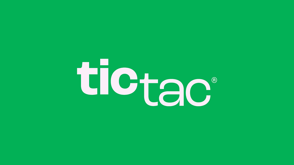
TICTAC REBRANDING
Luiza Amorim
Considering tictac® history and its unmistakable package, the rebranding will seek to update the brand. The logo will be a direct reference to the sound of the packaging, the opening, and closing of the lid, but also the shaking of the packaging itself. The displacement of the typography generates a movement of the logo and its contrast will emphasize its sound.


Visit Creator/s
Find out more information about the project and the creator/s here:
bottom of page